Introducing a new daycare to local families
Client
Babies and Beyond
Year
2020
Babies and Beyond was getting ready to open. The center needed a way to explain its programs to parents and introduce itself to potential staff in the community.
We started with workshops to agree on the business goals, audience, and visual direction. I developed the identity around rounded lettering and a turquoise-and-yellow palette, with illustrations that reflect the learning and play happening inside a daycare.
For parents, the website needed to answer a practical question: could this be the right place for their child? I organized the programs by age group and followed them with an invitation to visit the rooms and meet the educators.
I designed desktop and mobile layouts together in Figma, then built the responsive site in Webflow.
Scope of Work
A first introduction to the center
I developed the identity and website for Babies and Beyond’s opening. The work gave the daycare a recognizable look and a place to explain its approach to families who hadn’t visited yet.

Making room for play
Turquoise and yellow sit alongside classroom photographs and illustrations of children learning. The board brings the direction together: a brand that reflects the energy of childhood, with simple layouts that leave room for parents to read.
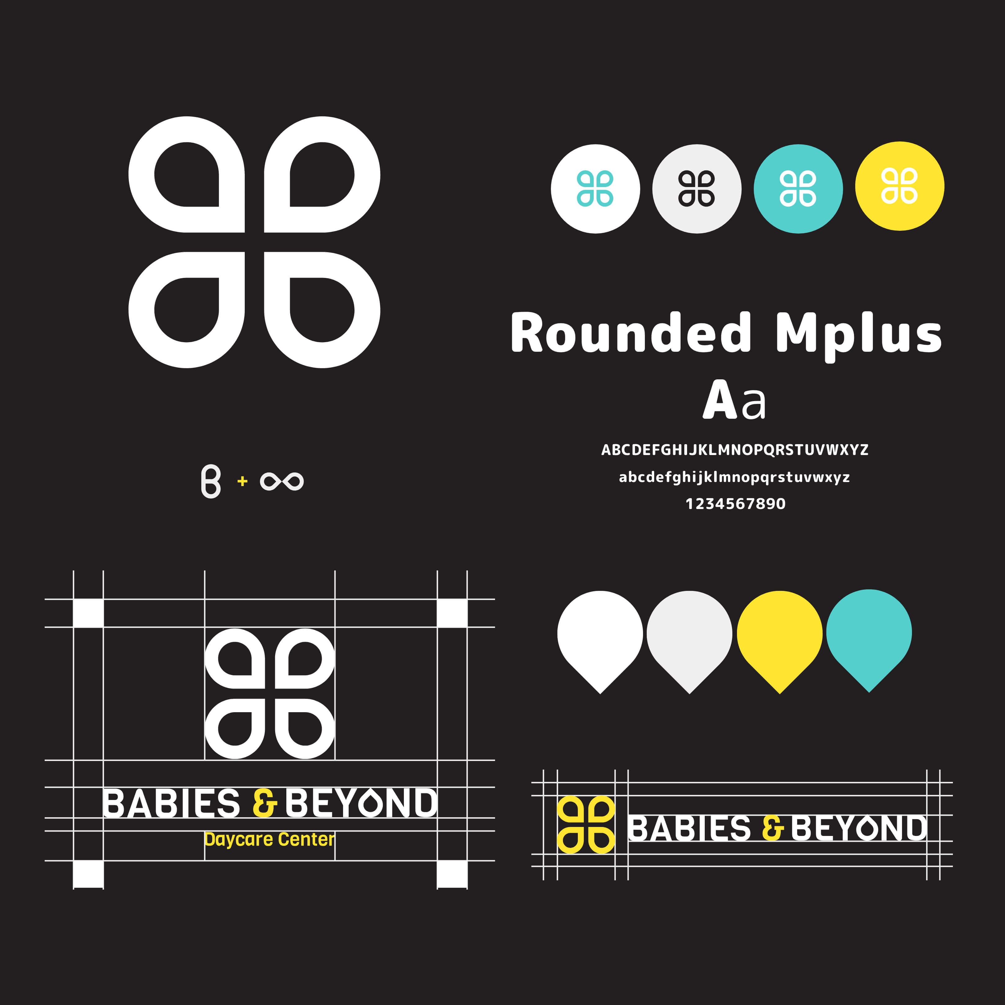

B meets infinity
The mark combines the letter B with an infinity symbol, tying Babies and Beyond to the phrase “Infinite Care.” I developed horizontal and stacked versions of the logo, along with color treatments for light and dark backgrounds.

A shared set of building blocks
Rounded Mplus lettering echoes the curves of the logo. The guide pairs it with a four-color palette and learning-themed artwork, including books and counting blocks. Those elements carry through the service cards and larger website illustrations.


Read about the care, then arrange a visit
The mobile layout gives each age group its own service card, so parents can find the program relevant to their child. The tour invitation follows, encouraging them to see the rooms and meet the people who would care for them.

Planning the smaller screen from the start
I designed both layouts together in Figma before the Webflow build. Service cards sit in a row on desktop and stack on mobile; larger illustrations rearrange around the text. The introduction and tour invitation keep their place in the page’s reading order.